


INTRODUCTION
Welcome to my UX case study, I'm excited to share my redesign of the JMU Parking Application. Tasked with improving the user experience of an application I use daily, I chose my university's parking app, recognizing significant usability issues that needed to be addressed.
To ensure my redesign was informed by user needs, I conducted extensive user research. Through surveys and interviews, I gathered valuable insights from participants, confirming that the issues I faced were common among all users of the application. Additionally, I sought their input on features that would enhance their overall experience within the app.
Armed with these research findings, I delved into the design process. I started by wireframing and mocking up a new layout for the revised application, focusing on addressing the identified usability issues and incorporating user-requested features. This stage allowed me to envision the potential improvements and create a solid foundation for the redesign.
To bring the design to life and provide a visual representation of the revamped JMU Parking Application, I used Figma to prototype the application. This final step added the finishing touches and allowed me to showcase the new design in an interactive and engaging manner.
Throughout the case study, you will find insights into my research process, wireframes, mockups, and the final prototype of the redesigned JMU Parking Application.
EXECUTIVE SUMMARY
James Madison University students constantly have difficulty finding parking on campus and often have to leave as early as an hour before their class begins to ensure they find a spot before their class. The JMU Parking app was created to help solve this problem by allowing students to see the number of spots available in each parking garage before even leaving their house, giving them enough time to plan when to leave. This app also has additional features like the option the purchase a permit, regulations, and a link to the parking website.
I use the JMU Parking app daily and have been an avid user since August 2021 but found that the app contains more features than just parking within the last week. These features would improve the functionality of the app if properly placed within the interface and were more accessible to users. In addition, the app’s design is rapidly becoming out of date and unappealing, I want to redesign the JMU Parking app to help users be aware of all functions, saving users time and simplifying their experience.
DESIGN QUESTION
How might we improve the experience of JMU students using the parking app to find a spot to park on campus?
USER RESEARCH
My user research included thirty-nine James Madison University students between the ages of 18 and 22 years old, with grades ranging from sophomore to senior. I didn’t find it important to include freshmen in my user research due to the fact that all freshmen must live on campus, therefore, they aren’t driving to class or using the parking app. Users completed a google form containing questions about their usage and likability of the JMU Parking app.
25.6% of users check the JMU parking app multiple times a day, 43.6% check the app at least once a day, and 10.3% use the app once every few days. The remaining users used the app somewhere between once a week and once a month, with only 4 users who had never used the app before. In addition, 94.9% of our surveyed users said they used the JMU Parking app mainly for finding available spots on campus.
From this survey, we also learned that 97.4% rated a three or higher when asked to rate their experience with the JMU Parking App. Although the users enjoyed the functionality of the app, we had a much higher range of responses when it came to ranking the interface of the app, with a higher quantity of responses on the lower end of the scale.
While there is some variety in user feedback, the JMU Parking application is used daily by most JMU students, and a majority of users agree that the interface could be improved. Based on user feedback and personal usage, three pain points can be identified.


PAIN POINTS
PAIN POINT 1: DESIGN OF INTERFACE
Users have stated that the current interface is not user-friendly and is very inefficient in terms of the way information is shown to the users. In addition, users wanted an option where they can view parking lot spaces as well as just parking garages.
PAINT POINT 2: FEATURES ARE HIDDEN
I asked users if they were aware of the feature giving them the ability to purchase a parking pass through the JMU Parking application and only 7.7% knew of this. When asked how many users would purchase their parking pass through the app after knowing this information, 76.9% of users said they would. This proves itself that if the features were properly laid out within the app, it would increase the number of users using the application for its intended purpose.
PAIN POINT 3: SLOW/NOT ALWAYS UP TO DATE
The form received a lot of responses stating that the information that the app shows isn’t always correct, or the information takes a while to load the updated numbers. By adding a reload button, we could solve the user's problem and increase the speed and efficiency of the app.
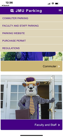
BEFORE PICTURES OF THE APPLICATION


WIREFRAMES
To better understand the layout of the JMU Parking application I created a wireframe of the interface. Using the wireframe from the current application design and my knowledge of UX design, I created a new wireframe of what the new layout will look like to better fit the user's requirements. I added an additional settings section to make the app more simple for users.


USER FLOWS
I created two separate user flows to highlight how the new wireframe would simplify the app and benefit users. I decided to use the two most app usages to show the user flow, using the app to find a parking spot on campus and the process of purchasing a parking pass using the application.


REDESIGN MOCKUPS
Here I created some drafts of what the updated application could look like:


IDEATION PROCESS
The first thing that I thought that it was important to accomplish with the redesign of the application is ensuring that all of the functions of the app are shown to the user in a clear and efficient manner. I did this by placing all of the available services on the homepage with an icon so that as the user enters the app the first thing their eyes see is all of the things they can accomplish. This solves users' pain points by increasing the visual appeal of the app as well as the functionality by showing them all of the services offered in a high-traffic area of the app as opposed to being hidden within a hamburger menu.
Next, I felt it was important to add a settings section within the application where users can sign in with their JMU email address so that when accomplishing tasks like purchasing a parking pass the user's account is already attached, eliminating the need to log in again when actually buying the pass. Within the settings, the user also has the ability to set a preference for students or faculty so they will only be shown the parking spots they can park in eliminating the extra step of having to click the same button every time they enter the application.
The third change I made to the application was not only a change to the look of the parking spot result page, but I also added a refresh button to give the users control of when the app gets updated with real-time parking information. I also decided to add a tab to each of the parking pages where you can switch between viewing the spots available in parking garages and parking lots. This solves the pain point of the application not having up-to-date information, as well as includes the users suggestions for the application by showing parking lot spaces. Finally, I made the name of the parking location a link that when clicked, would open maps to get the user to the desired lot in the shortest amount of time while still allowing users to know about how much time it will take them to get there. This will allow students to more accurately account for their time, eliminating the need to leave an hour early for class.
I felt like all of these changes make the application more enjoyable for users because they now have an app that is not only easier to navigate but is overall a better interface design and look for users.
CONCLUSION
By making these changes to the JMU Parking app, we will improve the experience of JMU students trying to find a parking spot on-campus.